Have you heard of color psychology?
Restaurant interior color is one factor that you need to consider when designing your restaurant. The color you choose can have a great impact on the customers. It can decide how the customers feel and how long they will stay on.
You should carefully choose your restaurant interior colors, which should be in sync with your restaurant’s concept. Different colors have different effects. Using warmer tones at the restaurant entrance lets the customers feel that the temperate is higher than usual, while color shades can relax customers.
The right restaurant interior colors can help to create an inviting and comfortable atmosphere, allowing your customers to feel at home and stay longer.
But what is the right color scheme you should use? To do this, you will need to understand more about the psychology of colors.

As a restaurant owner, you will want to understand more about the restaurant interior color before deciding what color to use. It is important to match the right colors, as it will impact the customers feeling and the ambiance in your restaurant.
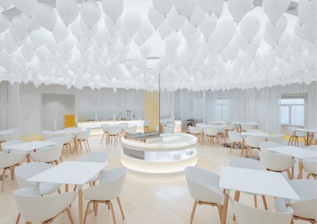
Light Color Scheme: A light color scheme is usually used to make a smaller room look bigger. Besides, it can add a leisurely and relaxing atmosphere to your restaurant. It can be a perfect choice for upscale restaurants and bistros. But a light color scheme won’t be a good choice if your restaurant has a high turnover rate. Colors include ivory, beige, white, pale, yellow, and light grey.
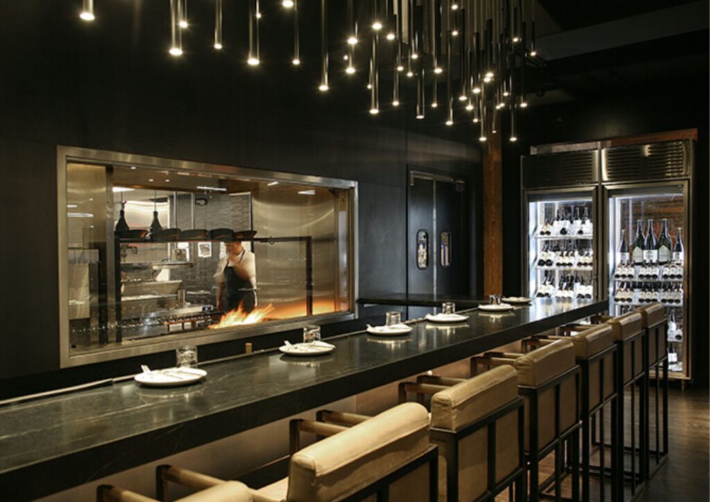
Dark Color Scheme: Suitable for creating an intimate and romantic setting. It will be a perfect choice if you are going for a romantic theme. But don’t overuse it, as it can make your space feel claustrophobic and cramped. Colors include brown, crimson, dark green, purple, and navy.
Warm Color Scheme: Warm color scheme can provide a lot of visual stimulation for your customers as it can be bright and exciting. But these bright colors can become irritating after a long period of time and cause a high turnover rate. These colors will be more suitable for fast-casual eateries, buffets, or fast-food restaurants. Colors include yellow, terracotta, red, gold, and orange.
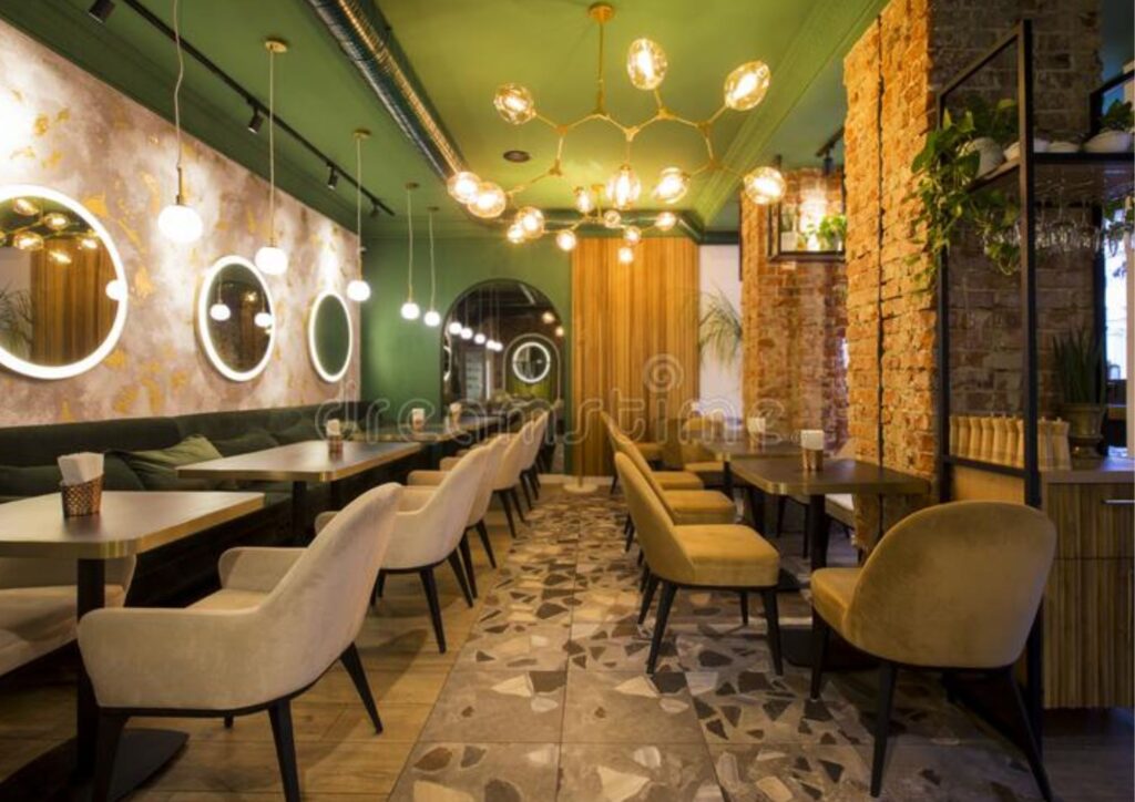
Earthy Color Scheme: These colors reflect colors you can normally find in nature. It features many greens and browns, such as brown, beige, olive green, dark orange, and umber. It can create a relaxed and welcoming feeling, which is ideal for cafes. It is becoming popular in many trendy restaurants nowadays. It can be a perfect choice if your restaurant focuses on healthy foods.
Pastel Color Scheme: This color scheme is very light and soft. Normally, you can find it being used by bistros, cafes, and casual eateries. These colors have an almost neutral tone, making them a great fit with most types of decor.

Light colors can make your space look larger and open. They reflect natural light, creating an illusion of more space and making your restaurant look bright and airy. It makes your restaurant feel less cramped and more welcoming.
The calm setting that a light color palette creates can encourage customers to relax while remaining awake and alert. When soft light tones surround people, they generally make healthier food choices both in ingredients and portion size. So you wouldn’t want to go overboard. It works best for restaurants that focus on breakfast and lunch.
You want to use them in contrast with other colors since they can act as diet suppressants. For example, if you are using beige for your restaurant, you can consider using a bit of green or white or even some red to break the effect of beige. Using some potted plants is another option. You should not aim for one specific emotion when deciding on color combinations. Generating a range of colors can maximize your benefit.

If you are focusing on creating an intimate ambiance, go for a dark color palette.
Using darker colors on your walls or floors will do the trick. It will make the space feel smaller, and they also absorb natural light. It can add depth and richness to your restaurant, creating a warm and inviting atmosphere.
Dark colors are often associated with fine dining, which can help create an atmosphere that aligns with your brand identity. Combining dark colors with warm lighting and comfortable seating can create a sense of luxury and relaxation. Your customers will feel pampered and indulged.
But you won’t want to overdo it. Using too many dark colors can make your space feel oppressive and gloomy.
Consider combining it with some light colors to balance the ambiance. Using paints, artwork, or other decorative elements can help to break up the dark colors and create a more visually interesting space.

Green and brown are often associated with nature. They can create a relaxing, calming, and soothing ambiance in your restaurant. It can encourage customers to stay for a while longer. Green is also often associated with freshness and growth, making it a popular choice for health-focused restaurants emphasizing natural and organic ingredients.
While brown is associated with warmth and comfort, it can create a cozy and inviting atmosphere and evoke a sense of security. Consider combining it with other colors, such as green or cream, to create a more harmonious and balanced ambiance.
If you are a health-based restaurant, consider applying a calm tone of green on the walls and a little hint of woody brown. But green doesn’t work well in bars and pubs, as these places often use dim lights. It will make green turn gloomy and depressing. While brown is perfect in patches and minimal uses but overusing it can tip over the overall look and make the restaurant look rustic.
It is important to use the right shades of green and brown to create the desired effect.
For example, a deep forest green can create a sense of relaxation, while a brighter shade of green can create a more energetic and lively atmosphere.

Need help with interior design? Idzine is your answer to it. We are experts in transforming space from virtual to reality. Our expertise in renovation design, oversight, and management ensures that your property is well-designed. We relentlessly focused on delivering meticulously created, beautiful, functional designs.